How to Choose Warm Neutral Kitchen Colors That Feel Effortlessly Cozy

The right color can make a kitchen feel calm, warm and welcoming in seconds. Warm neutrals do this better than any other shades, because they glow in daylight and soften at night. Below are warm neutral kitchen color palettes, each with its own mood, so you can find the one that feels like home.
How to Pick Your Warm Neutral
Start with undertones. A warm neutral leans yellow, red or pink, while a cool one leans blue or green. Hold a paint chip next to plain white paper and the undertone shows up quickly.
Next, check your light. North-facing kitchens get cooler light, so creamier, richer shades work best there. South-facing rooms can take paler tones without looking flat.
Then plan three layers. Pick one main color, one deeper shade for contrast, and one natural texture like wood or stone. That mix keeps a warm neutral kitchen from ever feeling dull.
Warm White and Honey Oak
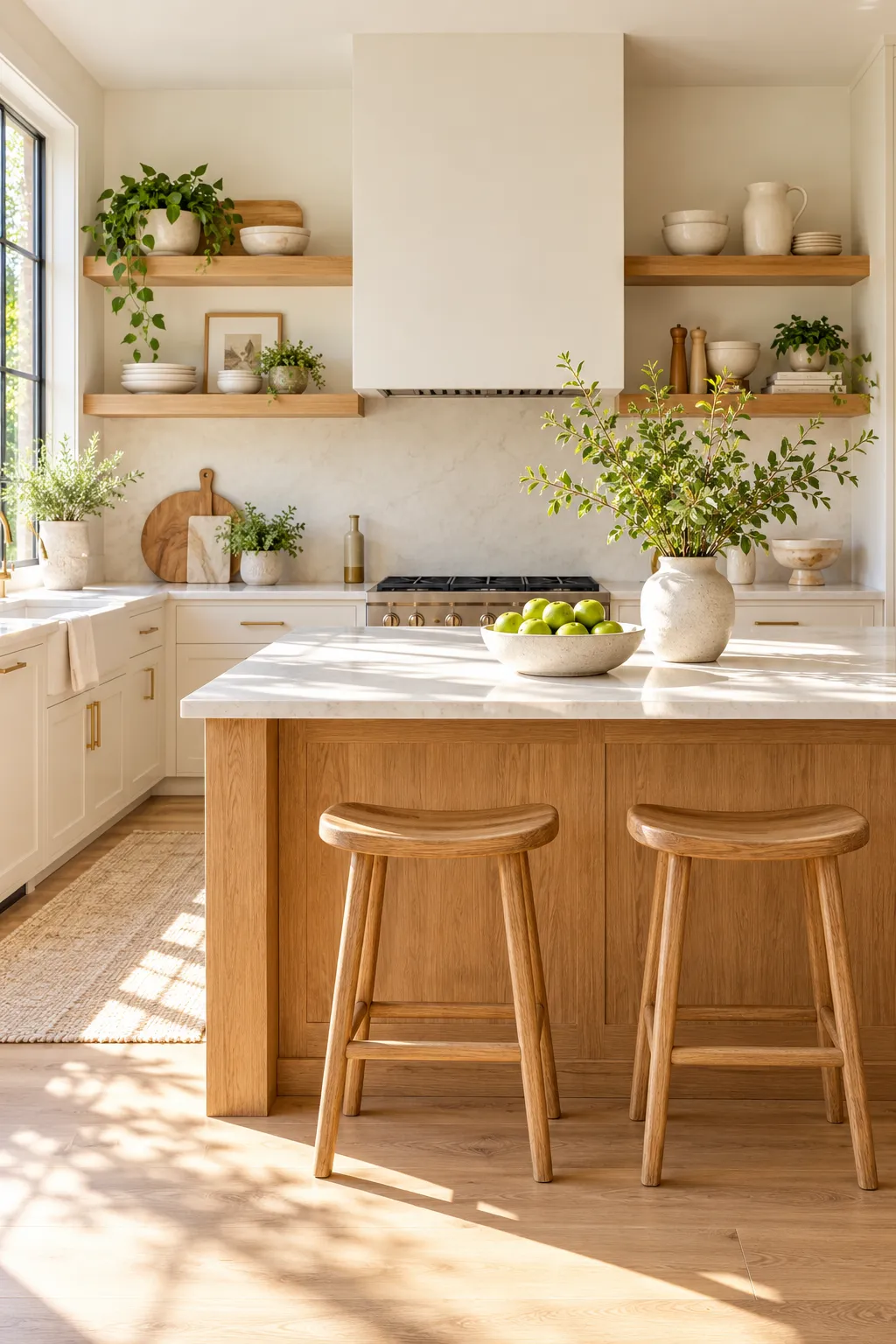
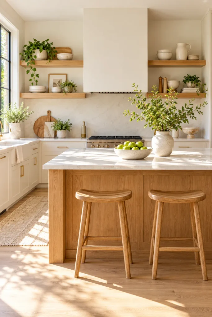
Warm white is the softest way into this palette. It’s white with a drop of cream, so it never looks cold or clinical. Sherwin-Williams Alabaster and Benjamin Moore White Dove are two reliable picks.
Use it on the cabinets and walls, then bring in honey oak through open shelves, stools or a wood island. The oak adds the warmth that plain white kitchens usually miss. The result is bright, fresh and easy to live with.
Soft Beige on Beige
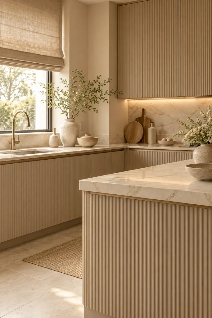
A tonal beige kitchen feels like cashmere in color form. Paint the cabinets a soft beige, then go one shade lighter on the walls. Pick a counter with beige and cream veining so everything flows. Sherwin-Williams Accessible Beige is a good starting point. Layering close shades this way looks rich, not boring.
Add texture so the beige doesn’t fall flat. Fluted cabinet fronts, a linen roman shade and a few cream ceramics are enough. It’s calm and quietly luxurious.
Greige and Dark Chocolate
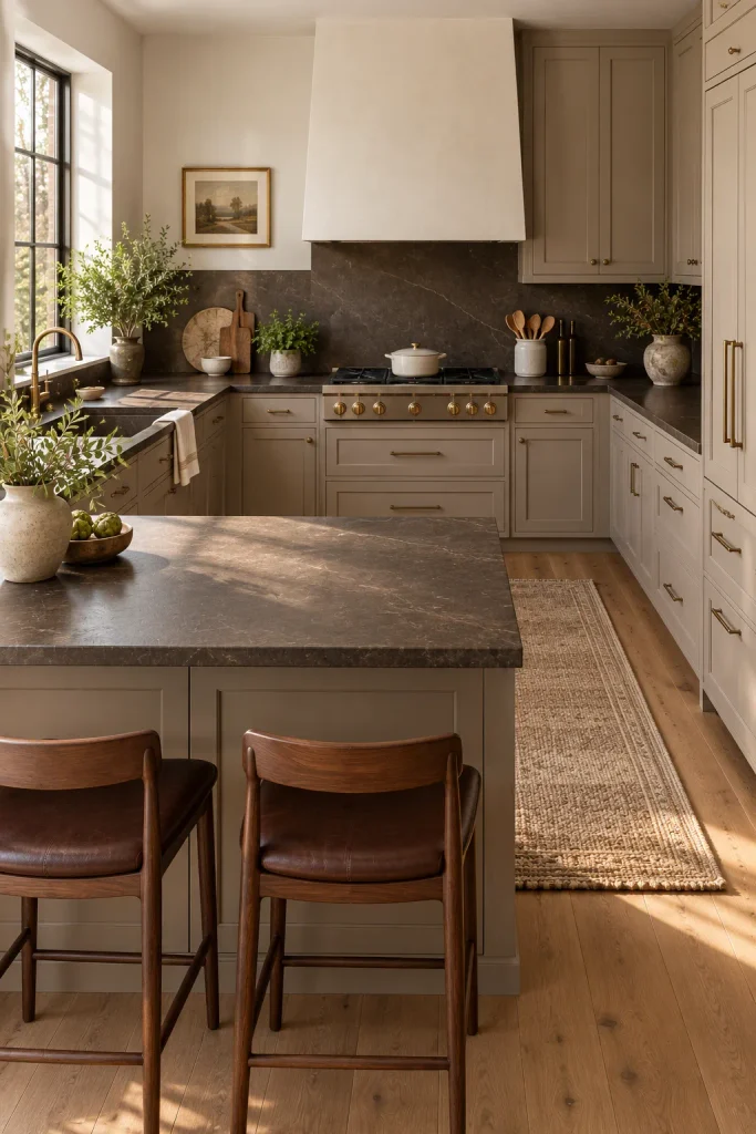
Greige sits between gray and beige, so it feels balanced and grown-up. On its own it can look a little flat. Pair it with dark chocolate and it suddenly feels rich.
Paint the cabinets greige, something close to Benjamin Moore Revere Pewter. Choose a deep chocolate-brown stone for the counters. Repeat the brown once more with dark wood stools. The contrast is bold, but soft, because both shades are warm.
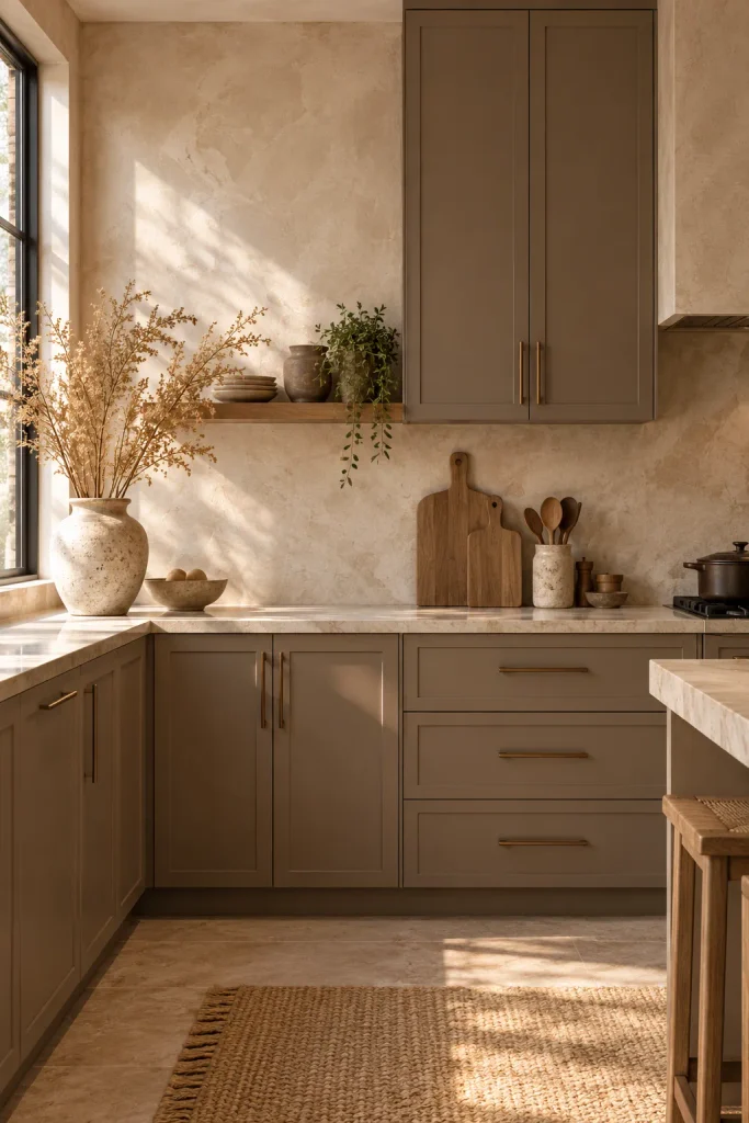
Mushroom and Limewash White
Mushroom is a brown-gray with a hint of violet. It’s earthier than taupe and feels very current. Farrow & Ball’s Jitney is a lovely example.
Put mushroom on the cabinets in a matte finish. Then use a warm white limewash on the walls for soft, cloudy texture. Next to it, the cabinets look deeper and more expensive. Bronze pulls finish the look nicely.
Sand and Clay Pink
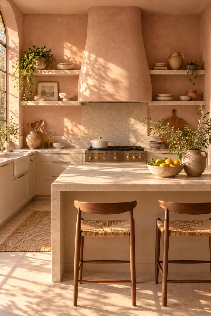
Clay pink is a faded, sun-baked beige with a rosy tint. Farrow & Ball’s Setting Plaster captures it well. Use it on the walls, ideally in a plaster finish.
Keep the cabinets sand-colored so they sit close to the clay without matching exactly. A pale stone counter ties the two together. The whole kitchen feels warm, soft and slightly Mediterranean. It’s a great choice if beige feels too safe for you.
Latte and Caramel
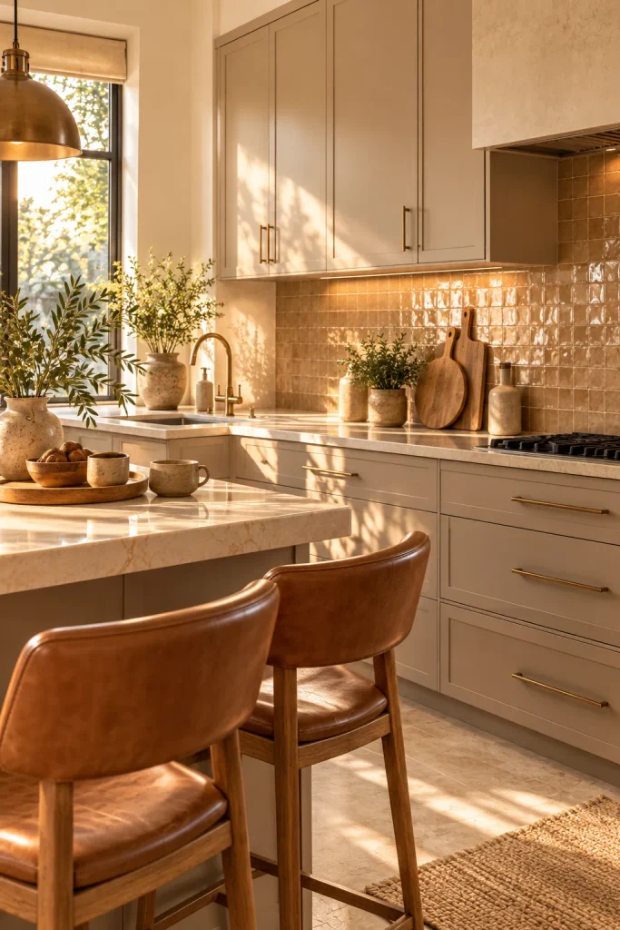
This palette feels like your favorite coffee shop. Paint the cabinets a milky latte brown; Sherwin-Williams Latte is an easy match. Cream walls keep it from feeling heavy.
Caramel adds the warmth on top. Bring it in through leather stools, a glossy caramel-toned backsplash or warm wood trays. The layered browns feel cozy and inviting.
Camel and Walnut
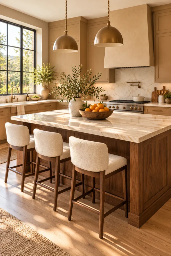
Camel is a golden tan with real depth. On kitchen cabinets, it reads warm and confident without feeling dark. It also hides everyday wear far better than white.
Pair it with a walnut island for contrast. The dark grain looks like fine furniture next to the camel. Top both with a creamy quartz to keep things light. Brushed bronze hardware finishes the palette.
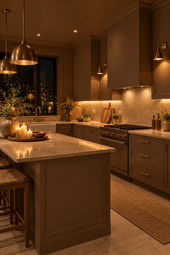
A Mocha Color Drench
Who says neutral has to be light? Paint the cabinets, walls and trim all the same warm mocha. Mocha Mousse was Pantone’s 2025 Color of the Year, and it still feels fresh in kitchens.
Because nothing breaks the color, the room feels calm rather than dark. Matte paint keeps it soft and velvety. A creamy stone counter gives the eye a place to rest. At night, with warm lamps on, it’s a warm neutral kitchen at its most dramatic.
Espresso and Cream
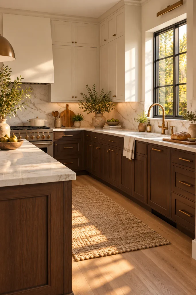
Want dark cabinets without a heavy room? Split them. Paint the lower cabinets espresso and the uppers cream.
The dark base grounds the kitchen, while the light top keeps it open. Your eye moves upward, so even low ceilings feel taller. A white marble counter connects the two colors.
Olive-Khaki and Mocha
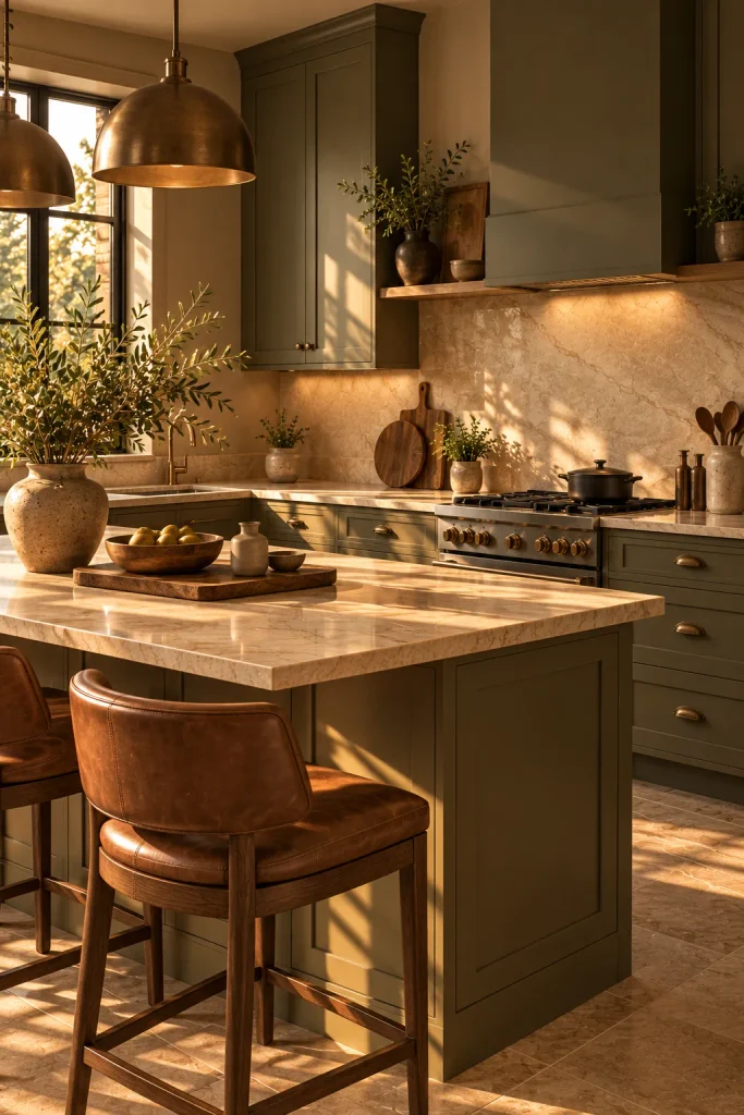
Olive-khaki is a muted green with lots of brown in it. Because it’s so softened, it works as a neutral. Farrow & Ball’s Bancha is a great example. Use it on all the cabinets, or just the island if you want to test it first.
Pair it with mocha browns in stools, wood boards or floor tiles. Antique bronze hardware feels fresher here than shiny brass. The mood is earthy and a little moody, perfect for kitchens that get afternoon sun.
Butter Cream and Marble
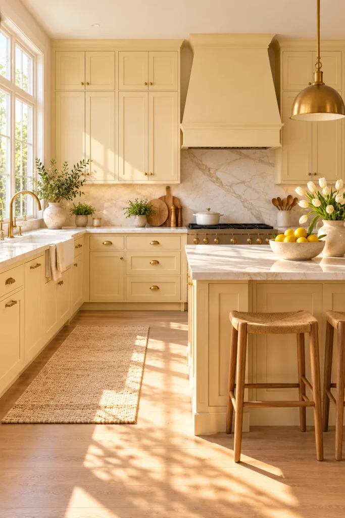
Butter yellow is one of the most saved kitchen colors right now. Its softest shade, close to fresh cream, acts as a warm neutral. Use it on shaker cabinets with brass knobs. Pair it with warm white walls and a pale marble counter. It feels sunny and happy, but still grown-up.
Cream and Terracotta
This palette is warm in the most earthy way. Keep the cabinets and walls a soft cream. Then bring in terracotta through floor tiles, a backsplash or a painted island; Sherwin-Williams Cavern Clay is a good shade for that.
Cream keeps the room bright, while terracotta adds heat and character. Wood and woven textures look great with both colors. It feels sun-warmed and modern at the same time.
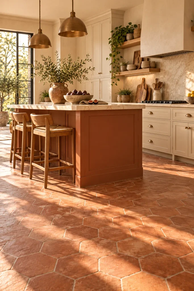
Warm Charcoal and Linen
Charcoal can be warm when it has brown in it. Sherwin-Williams Urbane Bronze is a good example. Use it on the cabinets or the island for depth.
Linen-colored walls keep the room soft around it. Add pale oak and simple shapes for a calm, Japandi-inspired feel. The contrast is strong, yet the overall mood stays peaceful.
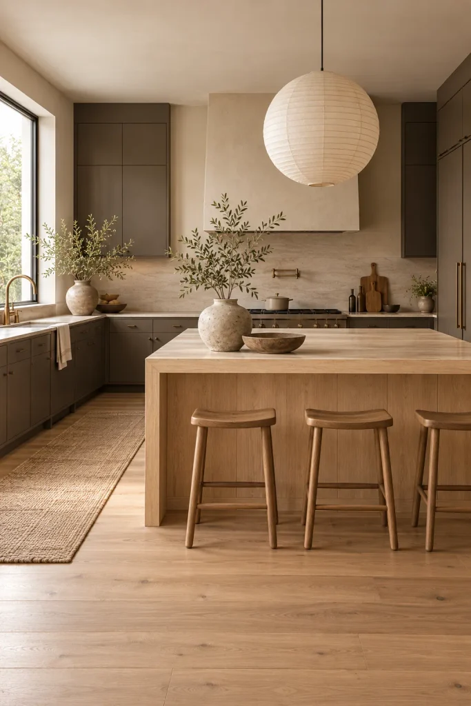
Stone Beige with Travertine
This palette takes its color straight from natural stone. Use honed travertine on the counters and backsplash, then paint the cabinets a matching stone beige. The room becomes one soft, sandy color story. It feels like a modern Italian villa.
Keep the decor simple so the stone stays the hero. Linen pendants and a few ceramics are plenty. Honed stone looks softer and more natural than polished.
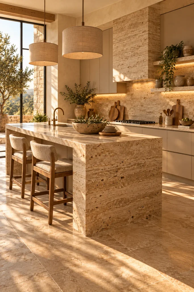
Warm Ivory and Soft Black
If you love contrast, this one is for you. Paint the cabinets warm ivory, then add soft black in the island, window frames or pendants. Choose a black with a brown undertone, like Sherwin-Williams Tricorn Black, so it doesn’t look harsh.
Ivory keeps the room bright and welcoming. The black adds definition, like eyeliner on a face. It’s crisp, modern and timeless.
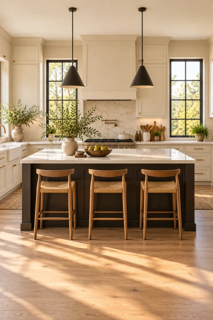
Which Color Feels Like You?
Go back to the palette that made you stop scrolling. That first reaction is usually the right one. Use it as your base, then add wood, stone or texture.
Always test paint on your own walls before committing. Look at it in the morning and again at night, since warm neutrals shift with the light. Get that right, and your warm neutral kitchen will feel cozy for years.