How to Use the Luxury Living Room Color Palettes Designers Secretly Love

Ever walked into a living room that felt expensive, even though nothing in it was flashy? That feeling almost always comes from color. When the walls, fabrics, wood and metal share the same undertone, the room looks calm, finished and pricier than it is.
Designers build luxury living room color palettes with a simple plan. One color covers the walls or the biggest piece, a second softens it in fabrics, and a metal or stone adds the glow. Below are the modern palettes they quietly rely on, with clear steps on where each color goes and the small pro tricks most articles skip.
Mushroom and Smoked Oak, the Quiet Star of Luxury Living Room Color Palettes
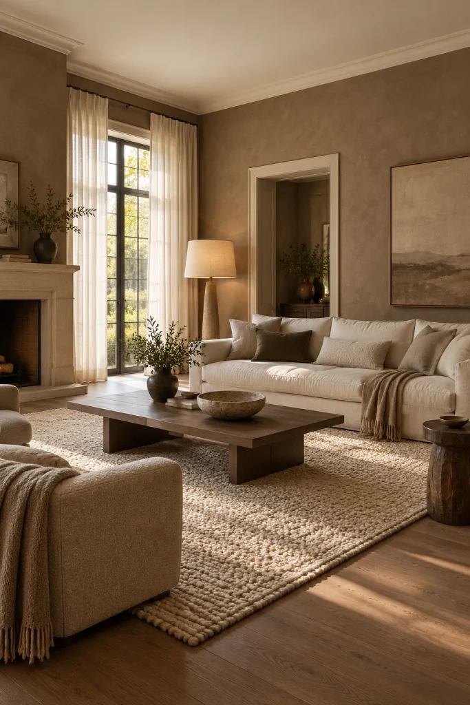
Greige had its moment, and mushroom is what replaced it. This soft brown-grey has a hint of pink, so it looks warm instead of flat. Paint it on all four walls in a matte or limewash finish. Use bone, a creamy off-white with no blue in it, on the ceiling and trim.
Keep the sofa in the same bone shade, in linen or a nubby weave. A low smoked oak coffee table is your only real contrast. Add a chunky wool rug and a linen lamp shade for texture. Here’s the designer trick: paint the trim in the same sheen as the walls, so nothing looks outlined.
Oxblood Walls With Espresso Wood and Brushed Brass
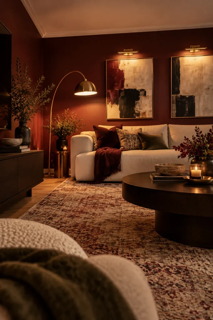
Picture a dark red room that feels cozy rather than dramatic. That’s oxblood, a brown-leaning red that’s deeper than burgundy. Paint the walls in eggshell so lamplight glows across them, and keep the furniture low and sleek, like a cream sofa and an espresso media unit. Brushed brass in a floor lamp and picture lights adds warmth. For a softer feel, paint the ceiling a pale pink-beige so the room doesn’t close in.
Deep Olive With Caramel Leather and Cream
Few colors are as easy to live with as deep olive. It looks earthy green at noon and almost brown at night. That shifting quality is why designers use it in rooms of every size.
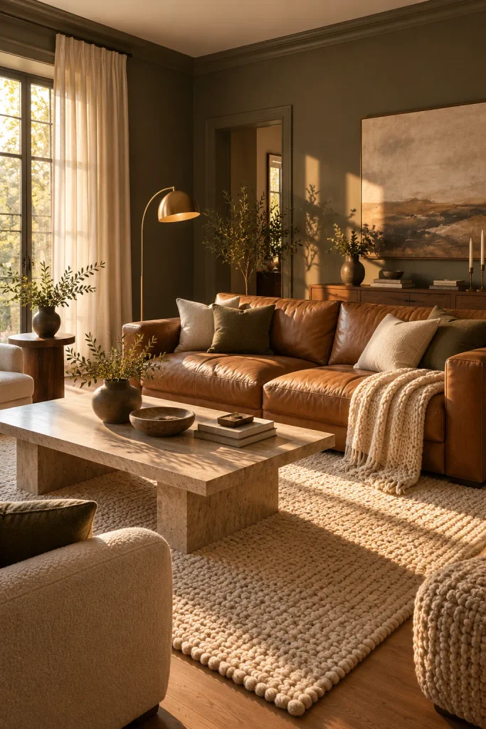
Paint the walls in a greyed olive with a matte finish. Make caramel leather the hero, either as a sofa or two lounge chairs. Then soften the scheme with cream curtains, a cream rug and a chunky knit throw.
Choose a cream with a yellow base so it matches the leather. Paint the skirting boards olive too, not white. That one change makes the walls look taller and the room more custom.
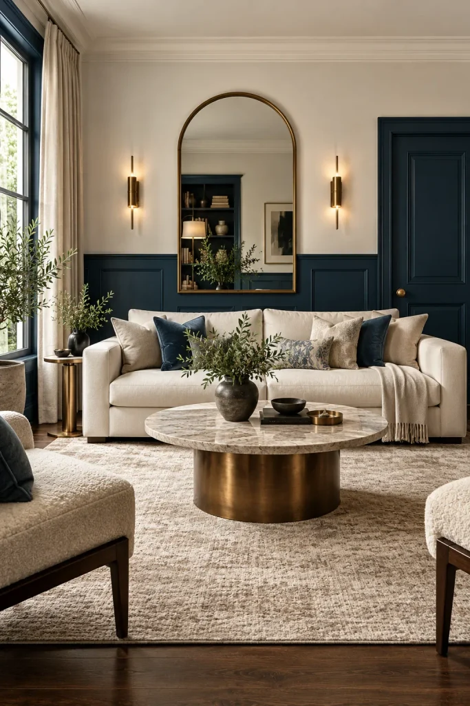
Ink Blue Panelling With Chalk White and Bronze
Swap your navy for ink blue and the room instantly looks sharper. Ink blue has a drop of black and a hint of green, so it never feels nautical. Use it on wall panelling or the lower half of the wall. Keep the upper walls and ceiling chalk white.
Burnished bronze is the metal that suits it best. Try it on a coffee table base, an arched mirror or a pair of sconces. Paint the doors and radiators ink blue too, and they’ll blend in instead of breaking up the look.
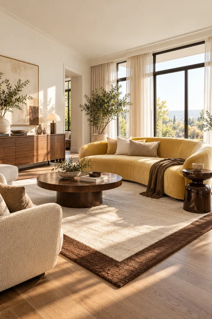
Butter Yellow and Chocolate Brown
Want a room that feels sunny on the greyest day? Put butter yellow on your biggest piece, like a curved velvet sofa or two armchairs. Add chocolate brown through a lacquered side table, dark wood or a rug border to make it feel grown-up. Keep the walls crisp white. Use bulbs around 3000K rather than very warm ones, because heavy amber light can turn butter yellow orange.
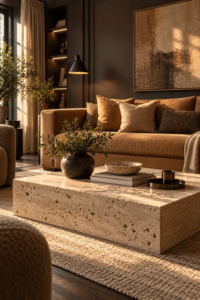
Charcoal, Camel and Travertine
Walk into a boutique hotel lobby and you’ll often see this exact trio. Charcoal sets a calm, tailored backdrop. Camel and travertine keep it from feeling heavy.
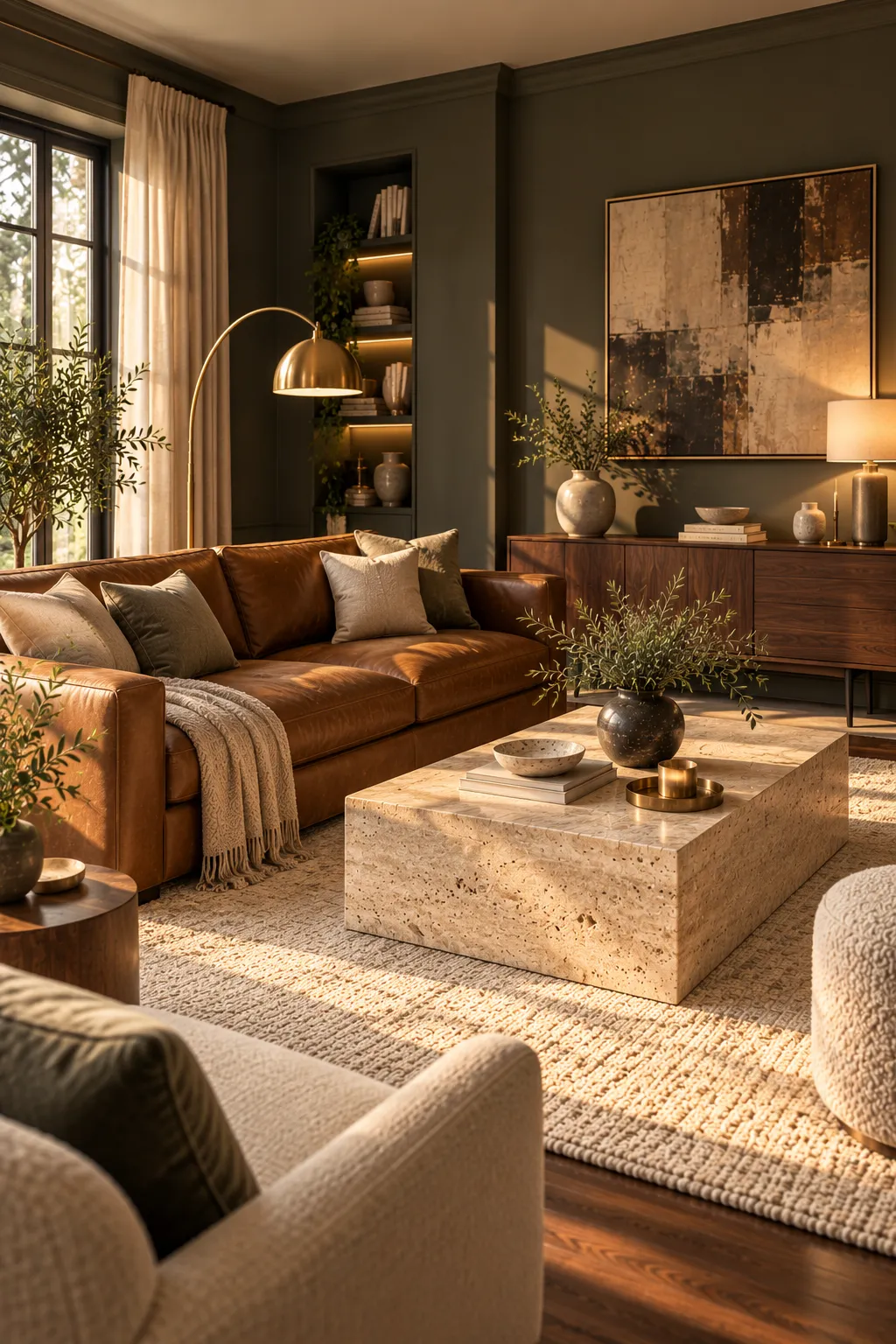
Choose a charcoal with a warm undertone, since blue-grey versions look cold. Add camel through a wool sofa, suede cushions or a heavy throw. Make a chunky travertine coffee table the centerpiece. Its pale, pitted stone lightens the room straight away. If real stone is over budget, a travertine-look plaster table gives a similar effect.
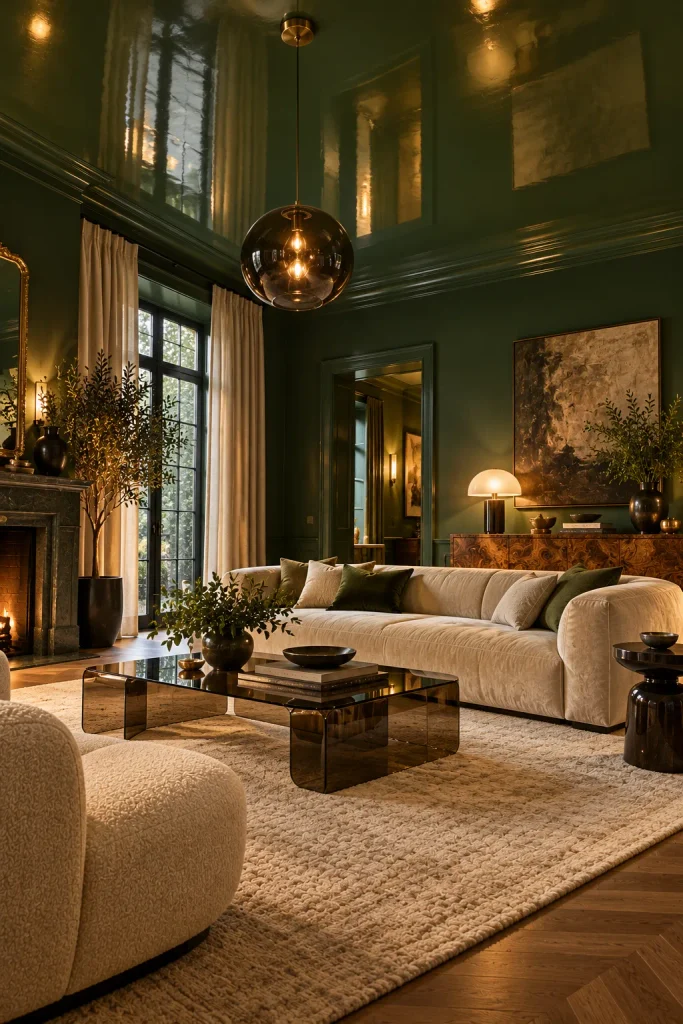
Color-Drenched Bottle Green With Burl Wood
Go all in with this one. Bottle green is darker and moodier than emerald. It looks best when you color drench, painting the walls, ceiling and skirting in one shade.
Drenching hides the edges of the room. Corners fade, and the space feels wrapped and intimate. It works especially well in a small living room you mostly use at night.
Add burl wood furniture with its swirly figured grain, plus smoked glass in a coffee table or pendant. A cream velvet sofa stops the room getting too dark. Designers often use a satin or gloss finish on the ceiling only. It bounces lamplight around and makes the green look like lacquer.
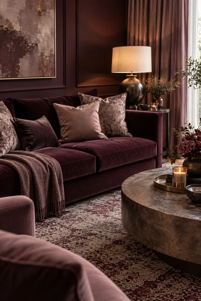
Aubergine and Dusty Mauve
Purple scares most people, which is exactly why this palette feels fresh. Aubergine is a deep plum-brown that looks grown-up on a velvet sofa or one feature wall. Dusty mauve softens it through the cushions, curtains and rug. Matte pewter lamps finish the look with a quiet silver tone that never shouts.
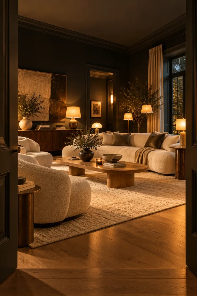
Soft Black Walls With Ivory Bouclé
Yes, black walls. They’re easier to live with than you think. Black blurs the corners, so a room can even look bigger. Pick a soft black with a warm base in a flat finish. It absorbs light and hides uneven plaster.
Against it, ivory bouclé looks like sculpture, so choose a curved sofa or two rounded chairs. Honey-toned oak on the floor or coffee table adds warmth. Lighting is the step most people skip. Use four or five warm lamps at different heights, and the room will glow instead of feeling gloomy.
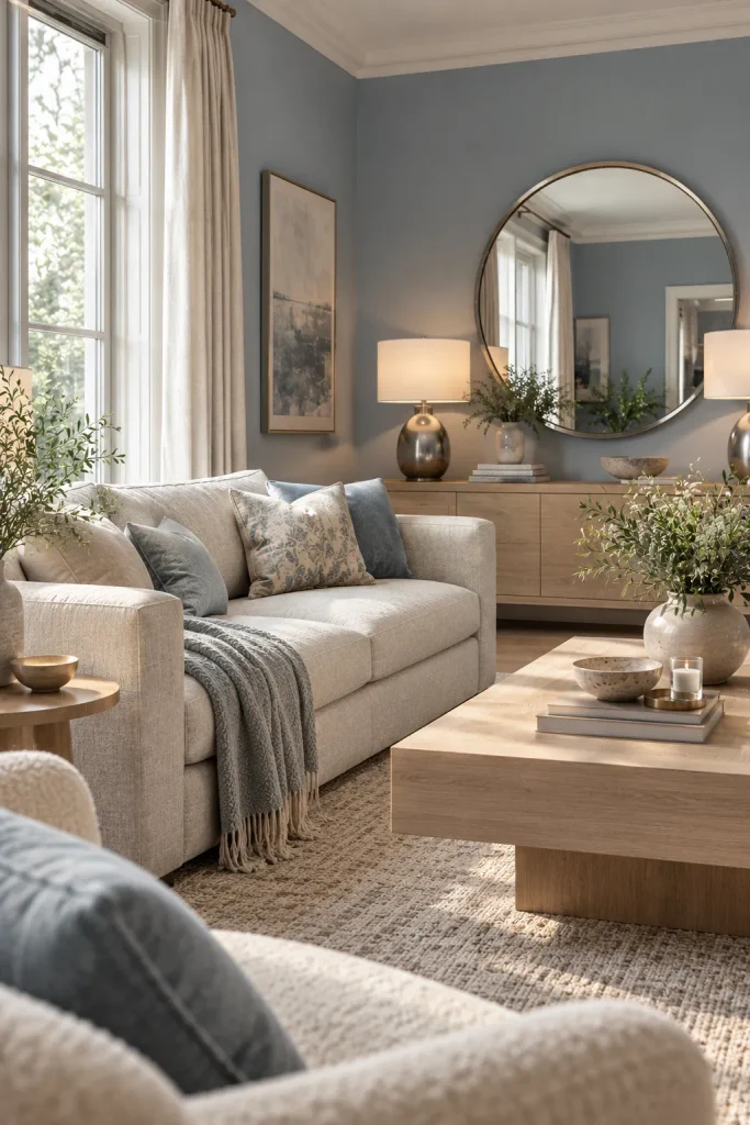
Pale Slate Blue With White Oak and Nickel
North-facing room? This is your palette. Pale slate blue stays soft in cool light, where plain white often looks grey and dull. Pair it with white oak furniture and a low sofa in undyed flax linen. Add polished nickel in lamps and mirror frames for a gentle sparkle. Skip bright white trim and use a soft putty white instead, or the blue will look cold.
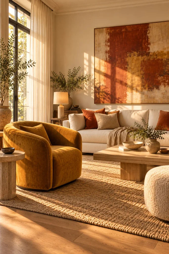
Saffron and Rust on an Ivory Base
Saffron and rust bring 1970s warmth without the clutter. The secret is a clean ivory base. Walls, sofa and curtains all stay soft and light.
Then add color in a few big moves. A saffron velvet barrel chair is a strong start. Rust linen cushions and one large abstract painting in rust and ochre finish it. Stop at two or three bold pieces, because more starts to look busy.
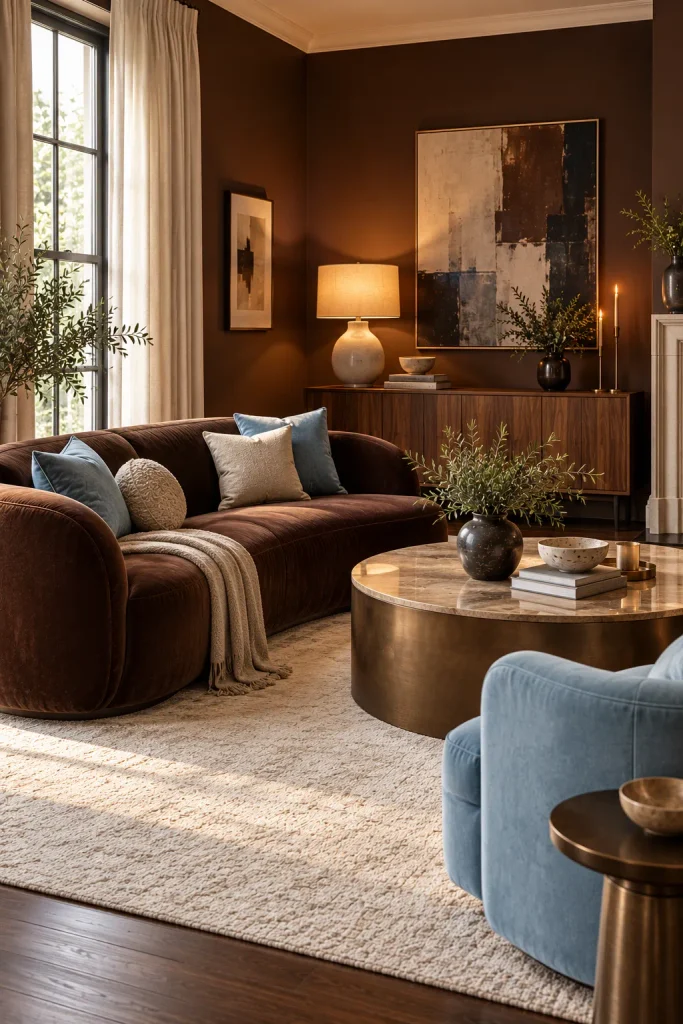
Chocolate Brown Meets Powder Blue
Brown is back in a big way. Chocolate walls or a chocolate velvet sofa feel rich and cozy. On its own, though, it can feel heavy.
Powder blue is the fix. It cools the room and adds a light retro charm. Use it on an armchair, cushions or curtains.
Of all the luxury living room color palettes here, this one has the most personality. Cream gives the eye a resting spot between the two colors. Walnut furniture and a sculptural ceramic lamp fit right in. Keep shapes low and curved so the look stays modern.
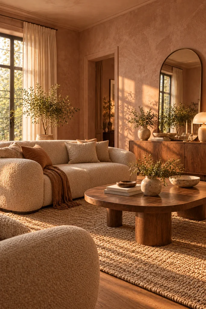
Clay Pink Plaster and Walnut
Forget baby pink. Designers choose a dusty, clay-like shade and apply it as limewash or plaster. The soft, cloudy texture makes it feel earthy rather than sweet. Add an oatmeal sofa, an arched mirror and rounded furniture to keep the mood gentle.
Walnut brings the contrast, and its dark grain looks rich against pale pink walls. Apply limewash with a wide brush in loose crisscross strokes. That visible movement is what makes it look high-end. Renting? Put the pink into linen curtains and cushions instead.
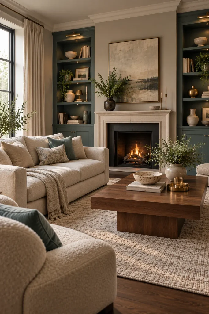
Verdigris Built-Ins With Oyster and Walnut
Ever noticed the blue-green coating on old copper? That shade is verdigris, and it sits between teal and sage. Paint it on built-in shelves or a fireplace wall for an instant focal point. Use oyster, a pale pearly grey-beige, for the other walls, the sofa and curtains, with walnut floors or a walnut coffee table for warmth. Can’t paint a whole unit? Paint just the shelf backs for a similar effect.
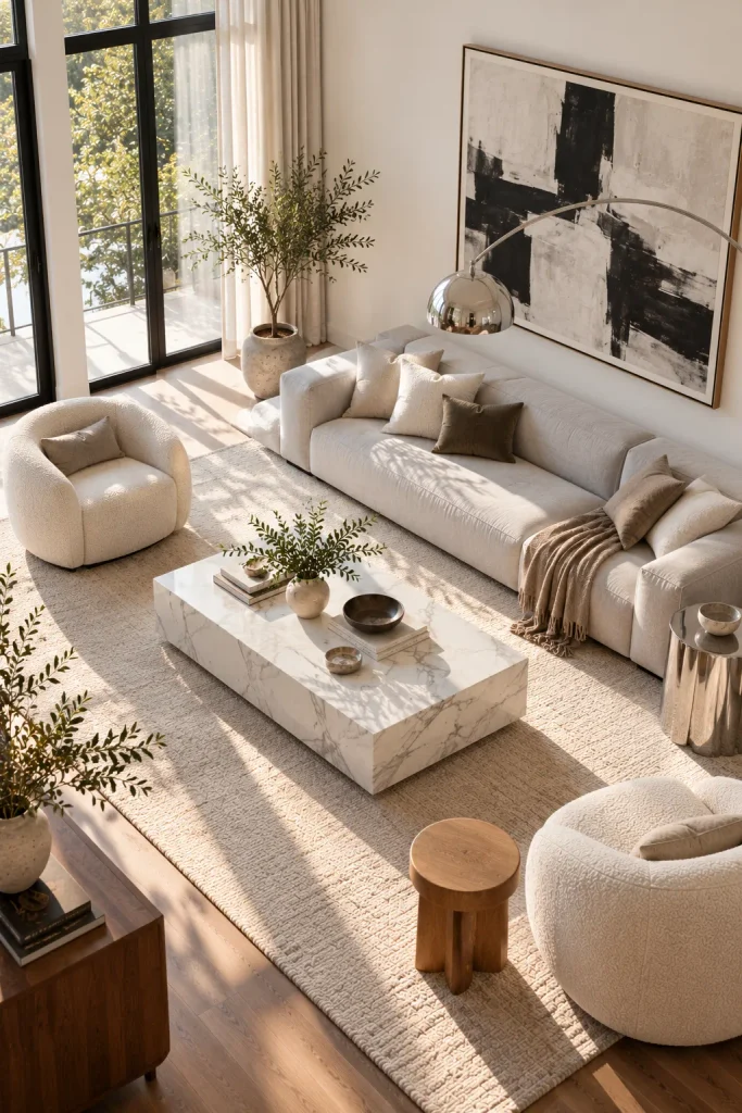
Marble Grey, Ivory and Polished Chrome
Every palette so far has leaned warm. In fact, most luxury living room color palettes do, so this cool one really stands out. Think soft marble grey, bright ivory and polished chrome, like a modern gallery. It suits bright apartments with clean lines.
Start with ivory walls and a low pale grey sofa. Make a marble coffee table with soft grey veining the centerpiece. Bring in chrome through a tubular side table or an arc floor lamp. Add one warm piece, like a solid oak stool, so the room feels lived-in rather than cold.
Before you commit, paint a large sample board and check it in morning light, afternoon light and lamplight. Colors often shift once they meet your windows and floors. When you’ve found the one, let your fabrics and metals follow its lead. That’s how luxury living room color palettes end up looking designer-made, even with furniture you already own.
You May Also Like