How to Layer Living Room Wall Art Like a Stylist for Focal Points That Wow
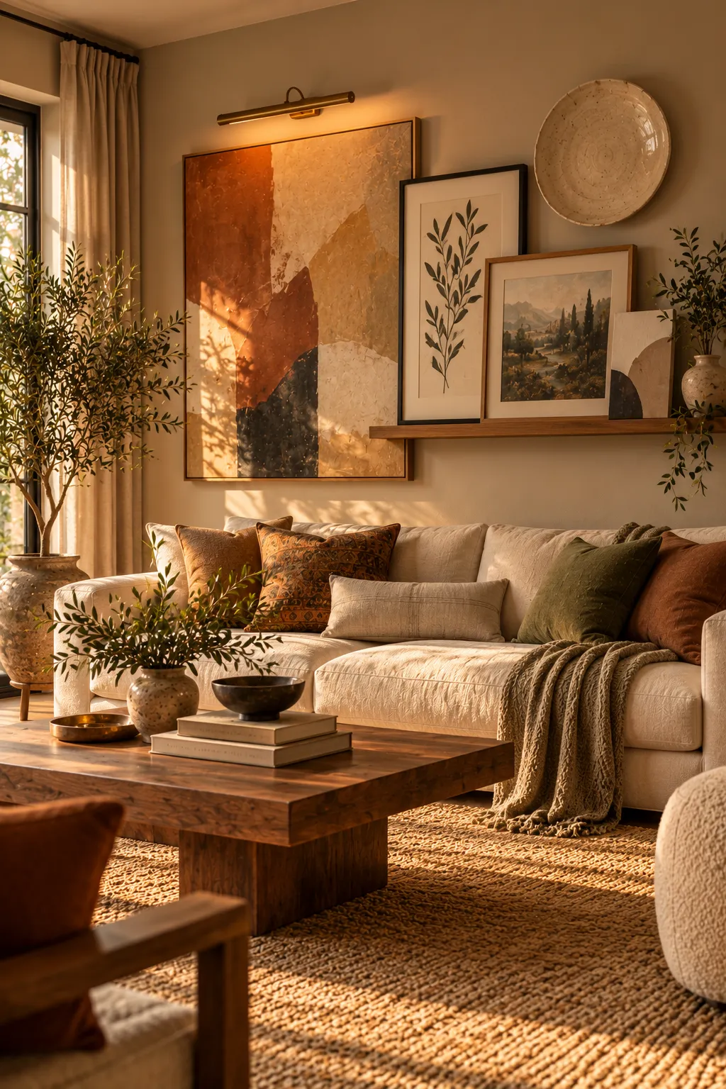

A wall that wows rarely comes from one frame hung alone in the middle. Stylists build layers: art in front of art, color behind it, light above it and objects around it. That depth is what turns plain living room wall art into a real focal point. Each idea below is a complete look, with the key pieces you need and simple steps to get it right.
Build an Overlapping Display on a Picture Ledge
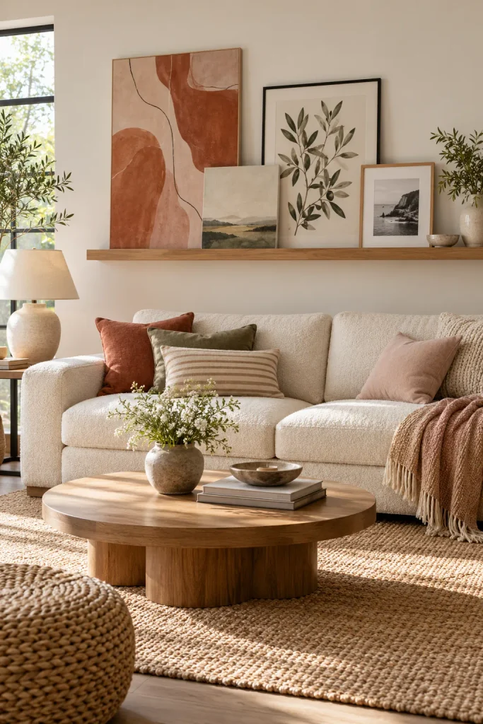
A picture ledge gives you the collected, styled look without a wall full of holes. It’s also the easiest way to start layering, because nothing is fixed in place. You can move frames around until the arrangement feels right.
How to do it:
- Mount a ledge about two-thirds the width of your sofa, 8 to 10 inches above the sofa back.
- Place your tallest piece toward one end, not in the center.
- Overlap each next frame so it covers a corner of the one behind it.
- Mix finishes, such as black metal, warm oak and one unframed canvas.
Don’t space the frames evenly. The overlap is the whole point. It makes the wall look gathered over time rather than bought in one trip.
Paint a Color Block or Arch Behind Your Art
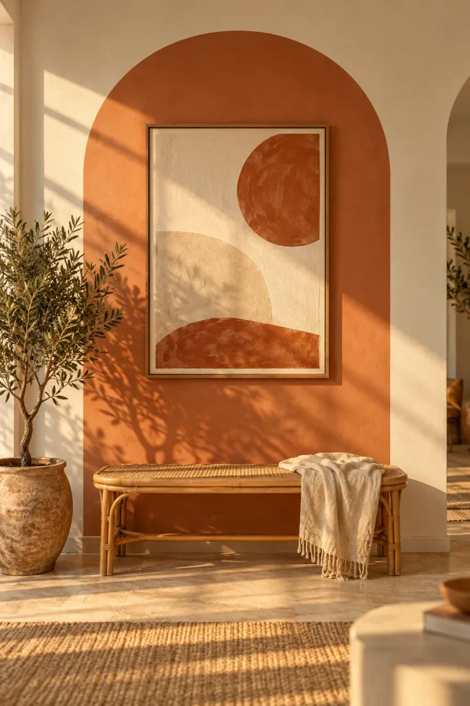
This one costs a sample pot and an afternoon. Paint an arch or a tall rectangle in a soft contrast shade, then hang your art inside it. The painted shape works like a giant frame and pulls the eye to the art from across the room.
Earthy shades feel most current, so think terracotta, sage, mushroom or butter yellow. Make the shape 8 to 12 inches wider than the art on each side. To draw a clean arch, tie a pencil to a string, pin the other end at the center point and swing it like a compass. Painter’s tape handles the straight sides.
Lean an Oversized Canvas on the Mantel and Layer in Front
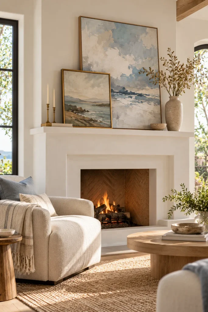
The fireplace is already the natural focal point, so give it art with real presence. Lean a large canvas on the mantel instead of hanging it. Then lean a smaller framed piece in front, shifted to one side so it overlaps the bottom corner. Two pieces at two depths look far more styled than one hung piece.
Choose a canvas that covers at least two-thirds of the mantel width. Let the smaller frame pick up one color from the big piece so they feel connected. Finish with one tall object on the open side, like a vase of branches, and stop there. A crowded mantel loses the layered effect.
Hang Framed Art Over a Rug or Textile
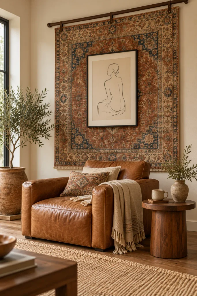
Textile walls bring a softness that frames alone can’t. Hang a vintage rug, a kilim or a heavy linen panel from a wooden rod, then hang a framed piece right on top of it. The rough weave behind a crisp frame creates contrast you can almost feel.
Keep one layer quiet. A busy rug in rust and indigo pairs best with a simple black-and-white line drawing. A bold graphic print looks best on plain oatmeal linen.
For the frame, push a long picture hook through the fabric and into the wall. This keeps the frame flat and stops the textile from sagging. Steam the textile once it’s up so the fold lines relax.
Color-Drench the Wall and Let Brass Frames Glow
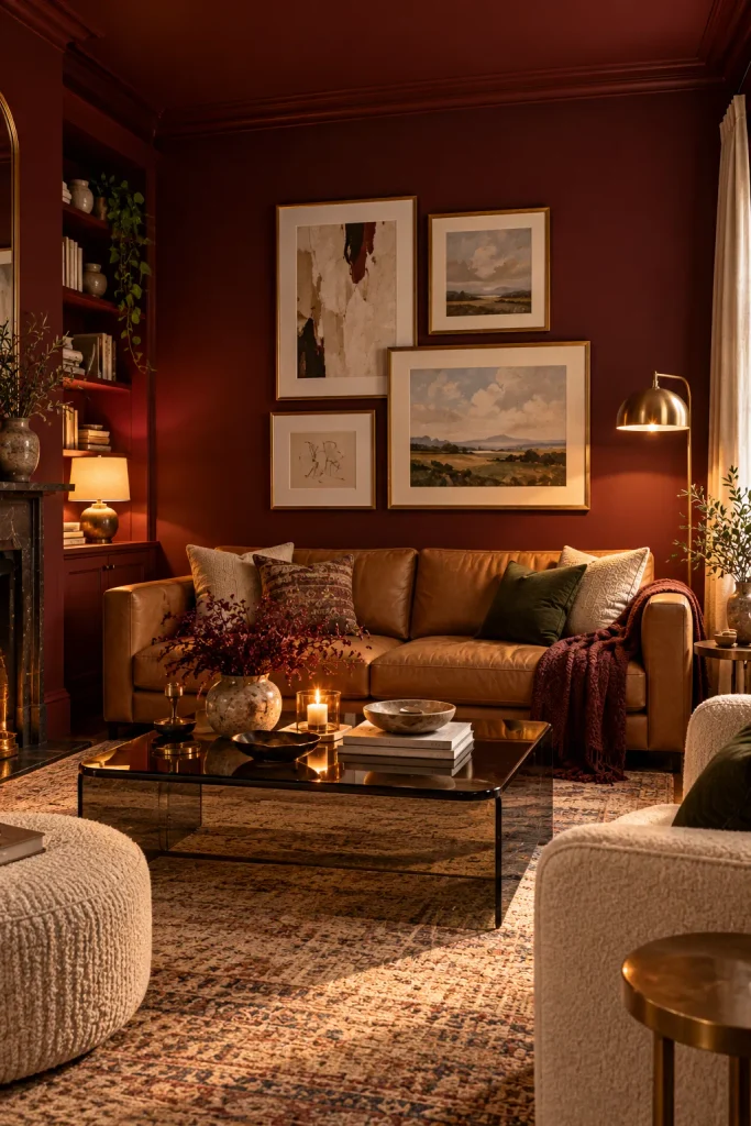
Color drenching means painting the walls, trim and sometimes the ceiling in one deep shade. It’s one of the strongest interior trends right now, and art looks incredible against it. On an inky navy, oxblood or chocolate brown wall, brass and gold frames seem to light up on their own.
Keep the art lighter than the wall so it stands out. Cream mats, pale abstracts and landscapes with soft skies all work well. Hang a few pieces close together rather than spreading them out. The tight grouping becomes one bold block against the dark backdrop.
Light Your Living Room Wall Art Like a Gallery
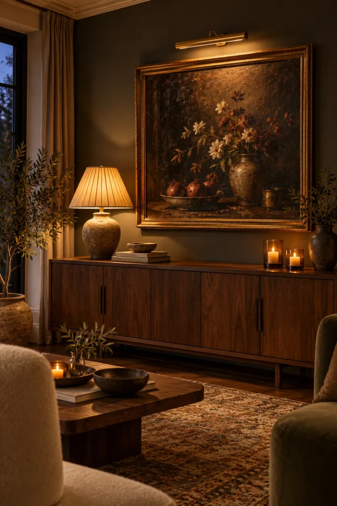
Lighting is the layer most people skip, yet it’s what makes art glow after dark. A brass picture light above a painting turns an ordinary sideboard wall into the coziest corner of the room. If you can’t hardwire, rechargeable picture lights with remote dimming look almost identical once installed.
Set it up in three light layers:
- A picture light directly above the art
- A table lamp at one end of the sideboard
- Candles or a small accent lamp at the other end
That gives you three pools of light at different heights, with the art right in the middle. Use warm bulbs around 2700K. Cool white light flattens paint colors and makes a room feel like an office.
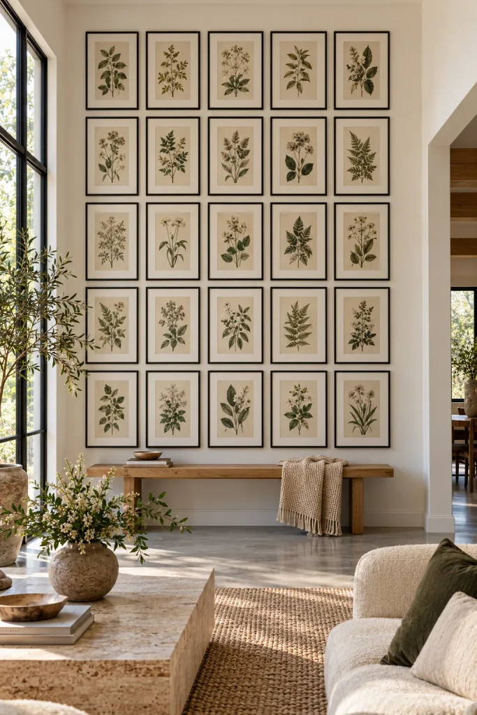
Create a Floor-to-Ceiling Grid of Matching Frames
For a crisp, modern look, swap the loose gallery wall for a strict grid. Use identical frames in one finish and hang them in even rows and columns. The repetition is what makes it striking, because the whole wall reads as one huge artwork.
Steps to get it right:
- Pick one frame size and color, ideally with white mats.
- Keep every gap exactly 2 to 3 inches.
- Start with the middle row at eye level, then build up and down.
- Use a laser level, since any crooked line shows instantly in a grid.
Prints from one series work best here: botanical studies, architectural sketches or a set of black-and-white photos. Place a slim bench or low console below so the grid has a base. It keeps the wall grounded instead of floating.
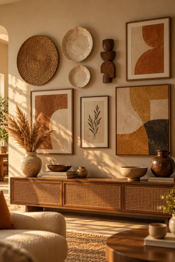
Mix Frames With Sculptural and Ceramic Pieces
Flat frames alone can feel a bit one-note. Bring in objects that actually come off the wall, like handmade ceramic plates, a carved wood sculpture, a woven seagrass disc or a plaster relief. They add shadow and dimension, and they make the arrangement feel artisan rather than mass-produced.
Keep the palette tight so it doesn’t look cluttered. Cream ceramics, walnut wood and art in clay and ochre tones read as one story, even with six different shapes. Hang the heaviest piece slightly off-center to anchor everything.
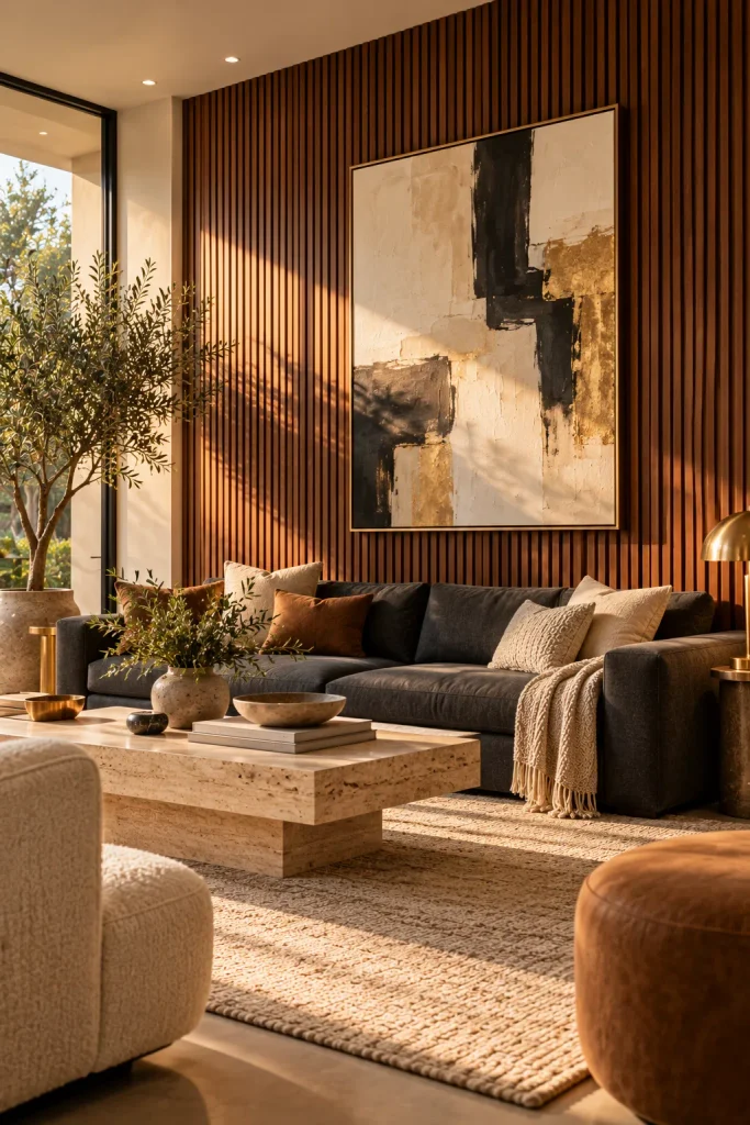
Hang Art Over a Wood Slat Wall
Fluted wood slat panels are everywhere in modern homes, and they make a beautiful backdrop for art. The vertical lines add rhythm and warmth. A framed piece hung on top looks sharper against all that texture.
Many slat panels come on a felt backing and install with screws or adhesive, so a feature wall is a realistic weekend job. Go for oak or walnut tones for warmth, or black for drama. Hang one large artwork centered on the panel, with a light mat so it stands out. Drive the hook through a gap between slats into the backing for a firm hold.
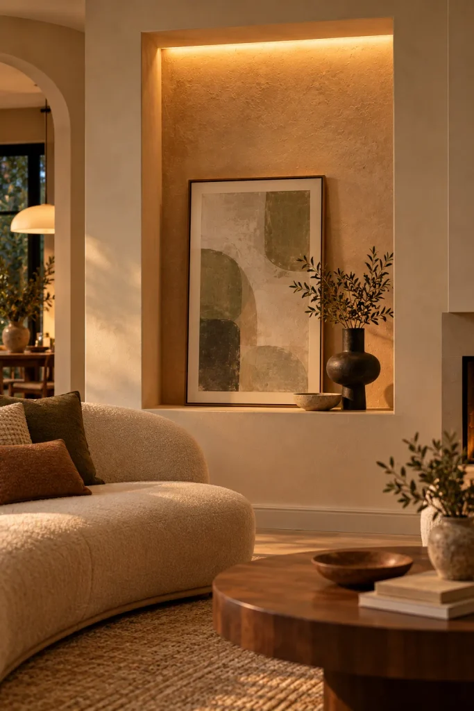
Display Art in a Backlit Wall Niche
A recessed niche turns art into architecture. Line the back of it with plaster, limewash or a bold paint color. Hide an LED strip along the top edge so light washes down over the art. Then lean one framed piece inside and add a single sculptural object.
No niche? Build a shallow box frame from MDF that projects out from the wall, or use a deep floating shelf with side panels. Paint it the same color as the wall so it looks built-in. You get the same framed-in glow for far less work than cutting into a wall.
Wrap a Gallery Wall Around a Corner
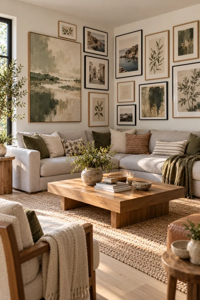
Corners are usually wasted space. A gallery wall that turns the corner creates a focal point you see from two directions, which makes the whole room feel more designed. It’s especially good behind an L-shaped sectional or a corner reading chair.
Start with a large anchor piece on one wall, about a foot from the corner. Let smaller frames continue around onto the second wall. Keep the top or bottom edge roughly level so the eye can follow the line.
Repeat at least one frame finish on both walls so the two sides feel connected. Before drilling, trace each frame onto kraft paper and tape the templates up. Moving paper is much easier than patching holes.
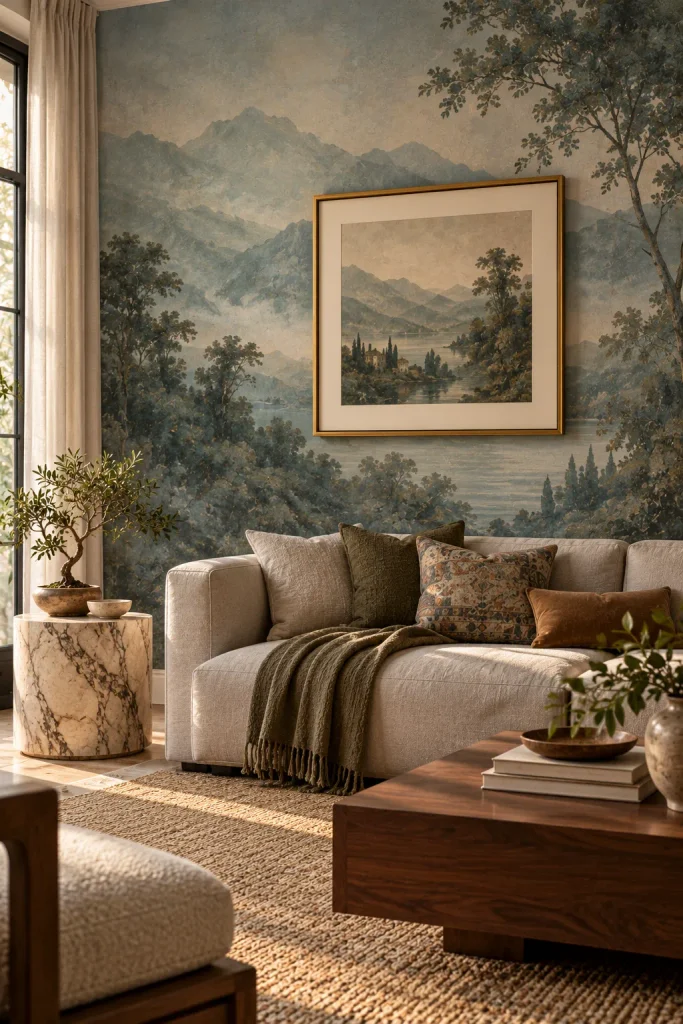
Layer a Framed Piece Over Mural Wallpaper
Scenic murals, like painterly landscapes, misty mountains or soft watercolor skies, are a big modern trend. Hanging a framed piece on top might sound odd, but it creates stunning depth. The mural becomes the background world, and the art sits in front of it like a window.
Choose a mural in muted tones so it doesn’t compete with the art. Hang one frame with a thick white or cream mat to separate it from the paper. Peel-and-stick murals make this easy for renters too.
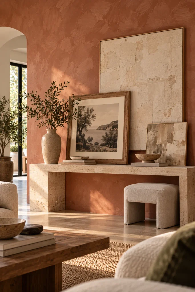
Go Tone-on-Tone With a Limewash Wall
Not every focal point has to shout. A limewashed wall in soft clay, stone or sand has movement built in, and art on top of it feels calm and gallery-like. Choose pieces in the same color family, such as beige abstracts, a sepia photograph or an off-white textured canvas.
Here the layers come from texture instead of color. Picture a cloudy wall, smooth paper, a chunky raw-wood frame and a linen canvas leaning on a console below. It’s quiet, but it’s the kind of quiet that makes a room look expensive.
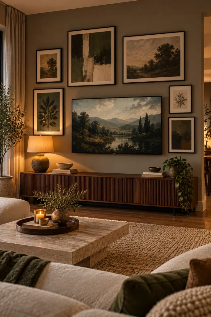
Style the TV Wall So the Screen Blends In
The TV is often the biggest thing on the wall, so stop fighting it and layer art around it instead. Surround the screen with a loose gallery of dark-framed pieces and moody artwork. The black rectangle then reads as one more piece in the collection. Keep 3 to 4 inches between the TV and the nearest frames, the same gap you use everywhere else.
If your TV has an art mode, display an image that matches the palette of the frames. Style the media console below with a lamp and a couple of objects. Hide cords with an in-wall kit or a paintable cord cover so nothing breaks the look.
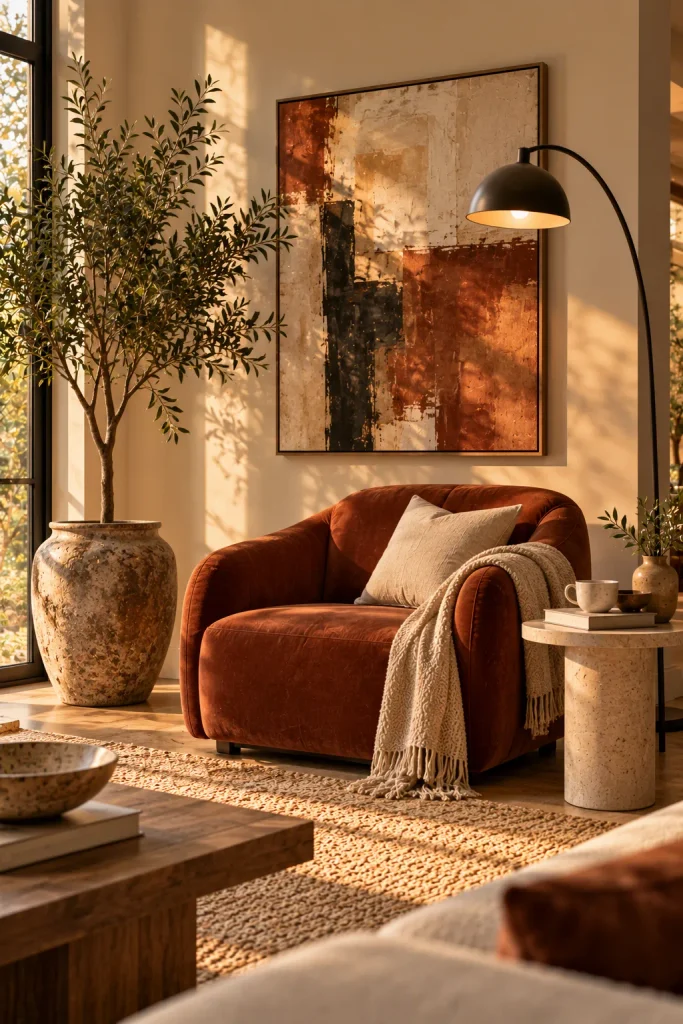
Build a Layered Vignette Around a Reading Chair
The most styled corners treat art as one layer among several. Start with an accent chair. Add a floor lamp that arcs over it, a tall plant on one side and a medium artwork above, hung at a height that relates to the lamp. Every element sits at a different level, so your eye climbs naturally from the seat to the leaves to the frame. A small side table with a stack of books gives the art a reason to be there.