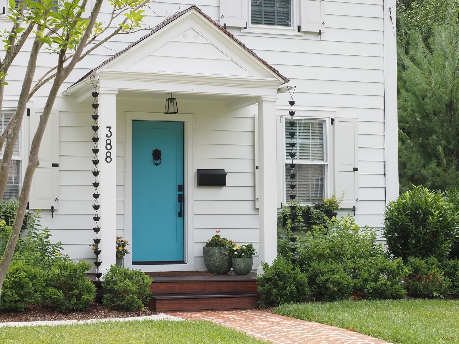
A Front Door Colour That Works With the Brick You Already Have
A front door is the cheapest visible improvement available to a house. One tin of paint, one afternoon, and the whole face of the building changes. It is also the decision most often made in the wrong place — standing in a shop under fluorescent light, holding a colour chart, thinking about a door in the abstract.
The door is not being chosen against a white card. It is being chosen against several square metres of brick, render or stone that you are not going to change.
Read the undertone of what you already have
Every masonry material has a bias, and once you see it you cannot unsee it. Red brick is rarely red — it is usually orange-leaning or purple-leaning, and the two want completely different doors. Yellow London stock is green-leaning. Grey render is either blue-grey or beige-grey and almost never neutral.
The test takes five minutes. Hold a piece of plain white paper against the wall in daylight. Whatever the wall appears to be next to true white is its undertone. Do it on an overcast day rather than in direct sun, and do it on the front elevation rather than the side.
What tends to work, by wall
- Orange-leaning red brick: deep blue-greens, near-black, and off-white. Avoid true red and most purples — they fight.
- Purple-leaning red brick: plum, deep grey-blue, and a soft sage. This brick takes cooler colours than people expect.
- Yellow stock brick: dark green, teal, and a warm charcoal. Yellow brick and navy is a reliable combination that always looks more expensive than it is.
- White or pale render: almost anything, which is the difficulty. This is where a strong colour earns its place, because there is nothing to clash with and a timid choice reads as indecision.
- Stone: follow the stone’s own warmth. Warm limestone takes olive and deep red; cold grey stone takes black, dark blue and bottle green.
The parts of the door that are not the door
A well-chosen colour is undone by three things faster than by anything else: mismatched metals, an unpainted or differently-painted frame, and house numbers that cannot be read from a car.
Pick one metal — usually a warm brass or a matt black — and use it for the knocker, the letterplate, the handle and the numbers. Paint the frame either the same colour as the door, which makes the opening read as a single deliberate block, or the same colour as the window frames, which makes it read as part of the building. Both work. Painting it a third colour does not.
Finish and durability
An exterior eggshell is the right finish for most doors: enough sheen to shed rain and be wiped, not so much that it shows every ripple in old timber. Full gloss is traditional on a Victorian door and unforgiving on anything that is not perfectly prepared.
South-facing doors fade. If your door gets full afternoon sun, expect to repaint a deep colour every four or five years rather than eight, and avoid the most saturated reds, which go chalky first.
Test it properly
Paint a sheet of primed card, not the door, and prop it in the doorway. Look at it at eight in the morning, at midday, and at dusk with the porch light on. A colour that works in all three is the right one. Most people look once, at midday, on a bright Saturday, which is the one lighting condition the door will almost never be seen in.
Common questions
Will a dark door make a small entrance look smaller?
Yes, slightly, and it will also make it look more deliberate. Small front elevations generally benefit from fewer colours rather than lighter ones — matching the door to the window frames in a single dark tone usually reads better than trying to open the space up.
What about a composite or uPVC door?
Both can be painted with the right primer and both are less forgiving of poor preparation. If the door is being replaced anyway, choose the colour at the point of order — factory finishes on composite doors last far longer than anything you can apply on site.
Related reading
The rest of the front of the house is covered in porch and curb appeal. Inside that same door, entryway storage that actually works is the other half of the first impression. And for reading colour against materials rather than against a chart, vintage and retro has the most useful historical reference points.