How to Pair Two-Tone Kitchen Cabinets Without Overdoing It
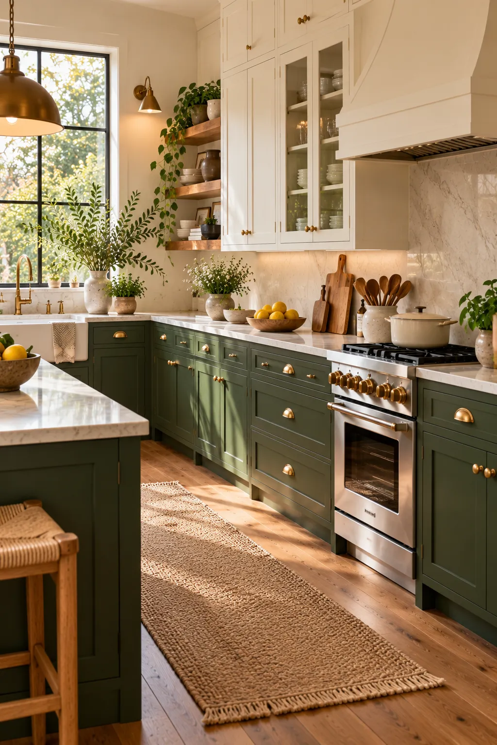

Two-tone kitchen cabinets can look stunning. They can also look busy, dated, or like two half-finished plans sharing one room. The difference comes down to a few choices: how far apart your colors sit, where the split falls, and what ties the two together. Every pairing below is modern and livable, and each one comes with the details you need to pull it off at home.
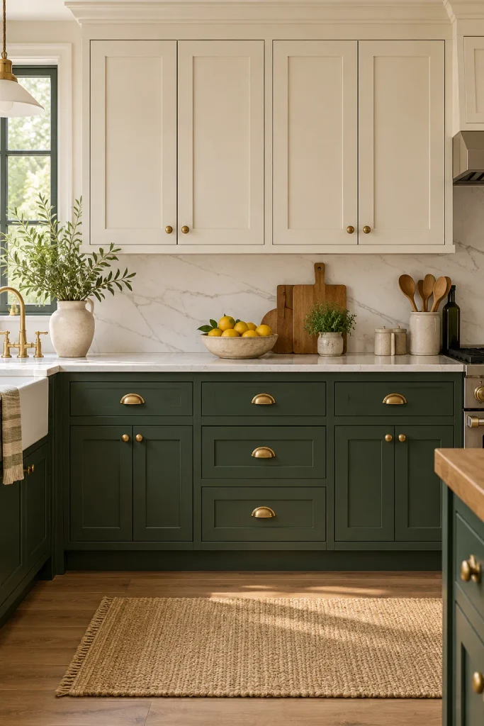
Forest Green Lowers With Warm White Uppers
The classic split still works when you choose the right shades. Go for a deep, slightly muddy forest green on the base cabinets. Pair it with a warm white that has a hint of cream on the uppers. Stark white and bright green look harsh together, while these softer versions feel calm and current.
How to get it right:
- Keep the darker color below. It grounds the room and hides scuffs.
- Use one metal on both colors. Unlacquered brass suits this pairing beautifully.
- Choose a light counter, like honed white quartzite, so the green never feels heavy.
Let a Walnut Island Be the Contrast
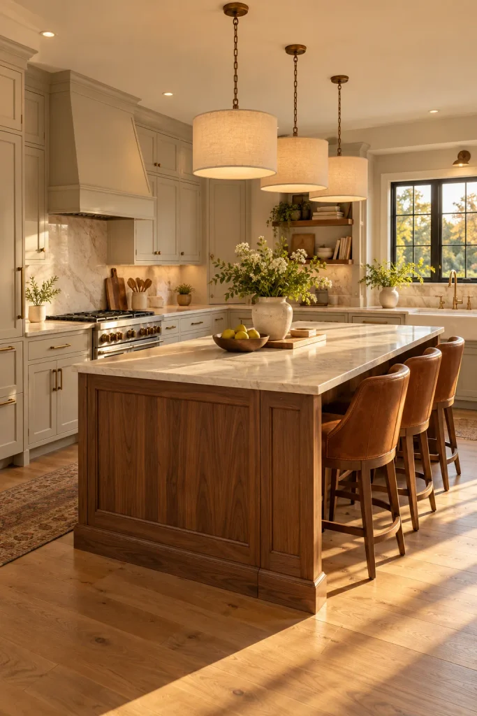
This is the easiest way to try two tones with very little risk. Paint all the perimeter cabinets one soft putty color. Then give the island a warm walnut finish. The wood adds richness, and you only have one paint color to live with.
Pick walnut with a straight, quiet grain, because wild swirls compete with the calm walls. A pale stone top, bronze pulls, and linen pendants overhead finish the look. Leather stools are a smart extra, since they echo the warmth of the wood.
Paint a Tall Pantry Wall in Deep Ink Blue
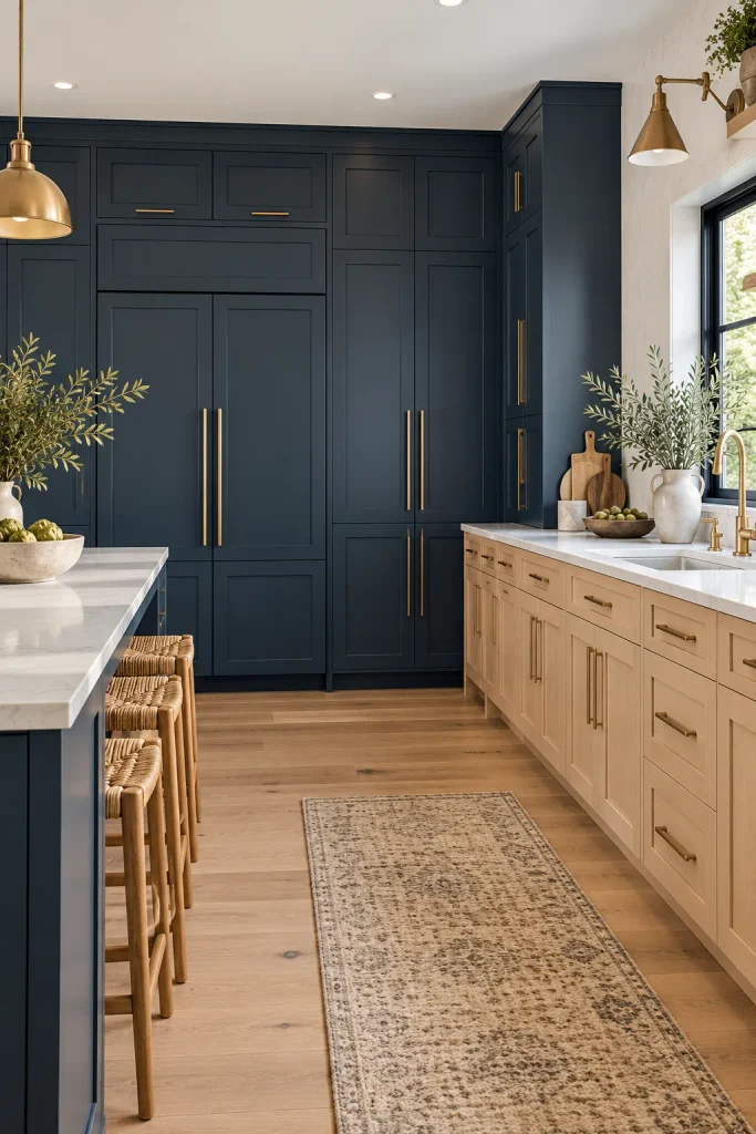
Tall cabinets are a perfect home for a bold second color. Paint one full wall of floor-to-ceiling pantry and fridge cabinets in deep ink blue. Keep the rest of the kitchen in pale white oak with white quartz counters. Because the blue sits in one solid block, it looks like architecture, not a stripe. Panel the fridge to match and add long brass pulls for a sleek, custom finish.
Try Dark Uppers Over Light Lowers in a Tall Room
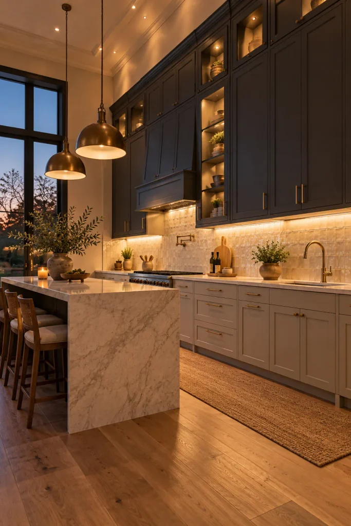
Most kitchens put the dark color down low. Flipping it can look striking in a room with high ceilings. Charcoal uppers that run to the ceiling make a tall kitchen feel cozier. Soft stone-colored lowers keep the work zone bright.
Good lighting is not optional here. Add warm LED strips under the uppers so your counter never sits in shadow. A light backsplash, such as off-white zellige tile, helps the dark band float instead of pressing down.
Skip this idea if your ceilings are standard height. The same trick that cozies up a tall room makes a shorter one feel cramped. In that case, the classic dark-below split is the safer choice.
Go Tone-on-Tone With Two Greens
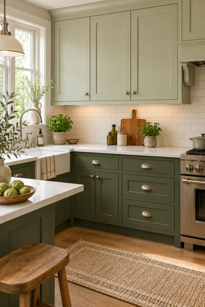
Want two-tone kitchen cabinets with almost no risk of clashing? Stay inside one color family. Paint the uppers a pale sage and the lowers a deeper olive. The look is soft and layered, and it suits small kitchens well.
How to get it right:
- Pick both shades from the same paint strip, two or three steps apart.
- Use polished nickel hardware to keep things light.
- Stick to white tile and a white counter so the greens stay the focus.
Color-Drench the Room, Then Float Wood Above
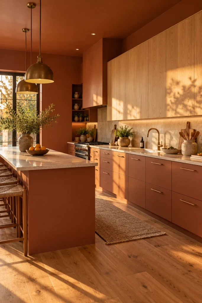
Color drenching means painting walls, trim, and cabinets in one shade. In a kitchen, paint the base cabinets, the walls, and even the ceiling a warm clay terracotta. Then hang light oak wall cabinets on top of all that color. The room feels wrapped and cozy, and the oak becomes the only contrast.
This is one of the most current kitchen looks, and it works best with simple slab doors. A cream or clay-toned stone counter keeps the palette tight. Matte black or brass pulls both suit it, so match whichever finish your faucet has.
Turn the Coffee Station Into a Statement
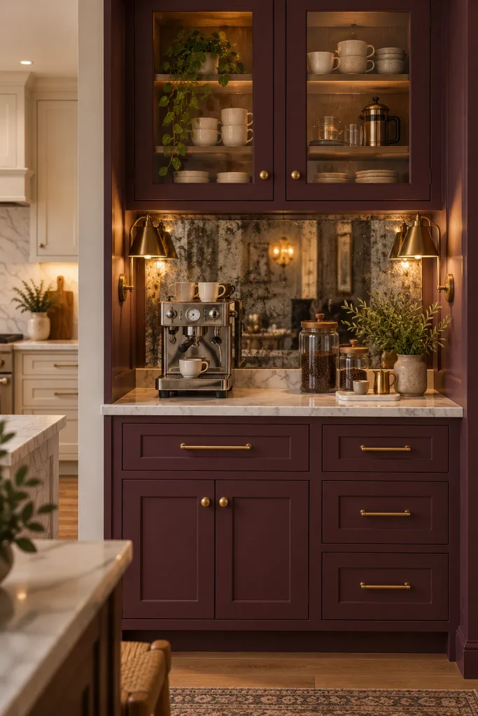
A coffee or drinks corner is a great spot for a braver shade. It has clear edges, so a bold color looks planned rather than random. Paint just that bank of cabinets deep plum and keep the main kitchen soft cream. Add a smoky mirror backsplash, brass pulls, and a sconce on each side, and it will feel like a custom built-in.
Pair Black Steel Glass Uppers With Cherry Wood
This pairing mixes materials instead of paint colors. Slim black steel-framed glass cabinets sit up top. Warm cherry wood cabinets sit below. Cherry is making a comeback, and the thin black frames keep it crisp and modern.
The glass keeps the upper half light, so this suits darker kitchens. Style the shelves loosely with clear glasses and a few cookbooks. A honed charcoal soapstone counter and a matte black faucet repeat the black frames down below.

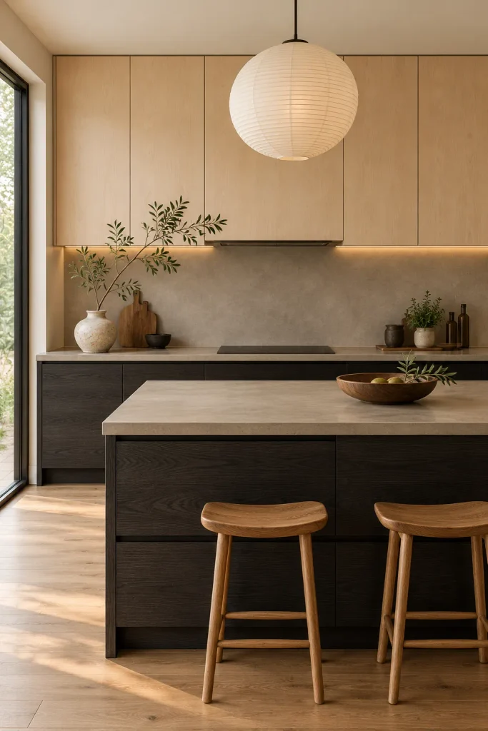
Mix Two Woods for a Japandi Kitchen
You don’t need paint at all for this idea. Put dark ebonized ash on the lower cabinets and pale maple on the uppers. The two woods have opposite moods. Yet they feel unified because both are natural and textured.
Keep everything else simple. Go handleless with finger pulls cut into the doors. Use a warm gray microcement backsplash and counter. One paper lantern pendant and a vase with a single branch is all the styling you need.
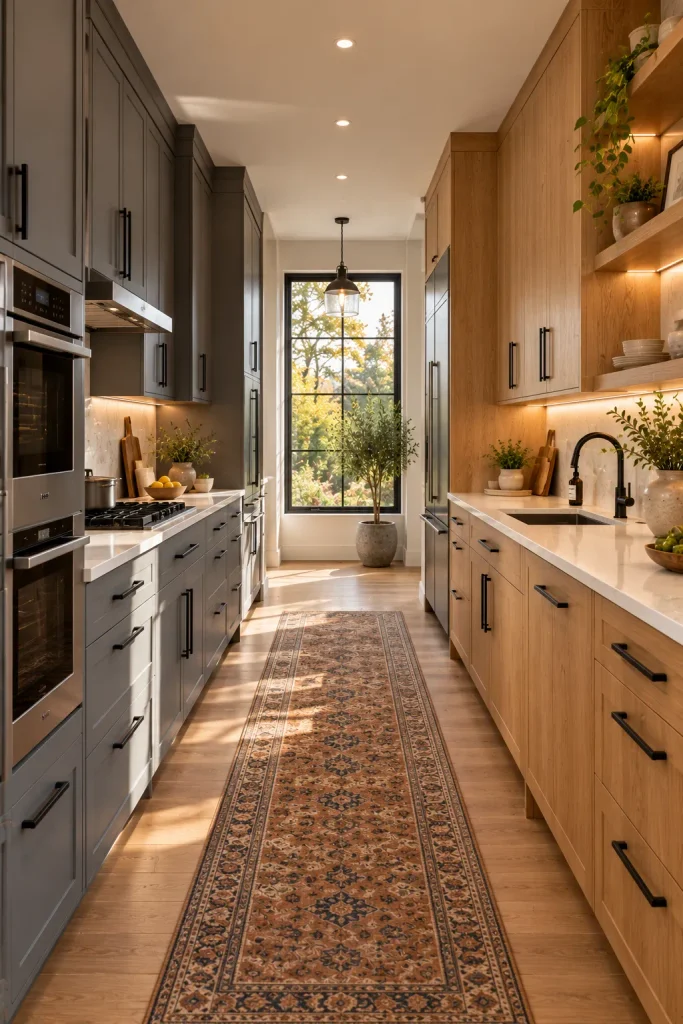
Two-Tone Kitchen Cabinets Split by Wall in a Galley
In a narrow galley, an upper-and-lower split can make the room feel like a tunnel. Split it by wall instead. Paint the appliance side a muted slate gray. Keep the opposite side in natural rift-cut oak.
As you walk through, you see one color at a time, which feels calm. Use the same counter and the same matte black pulls on both sides. That way, the two walls still read as one kitchen. A runner rug down the middle softens the space.
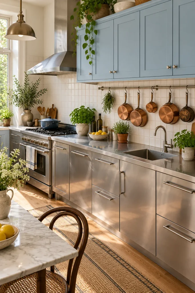
Stainless Steel Lowers With Powder Blue Uppers
Love to cook? Stainless steel base cabinets are tough, heat-proof, and easy to wipe down. Pair them with soft powder blue uppers, and the look turns bistro-chic instead of commercial.
It’s one of the few two-tone kitchen cabinets ideas that’s as practical as it is pretty. An integrated stainless counter gives a sleek, continuous surface. Keep the pulls simple and stainless too.
Add warmth with what you hang on the wall. A rail of copper pans and a few potted herbs stop the steel from feeling cold. Plain white square tile behind it all keeps the focus on the blue and steel.
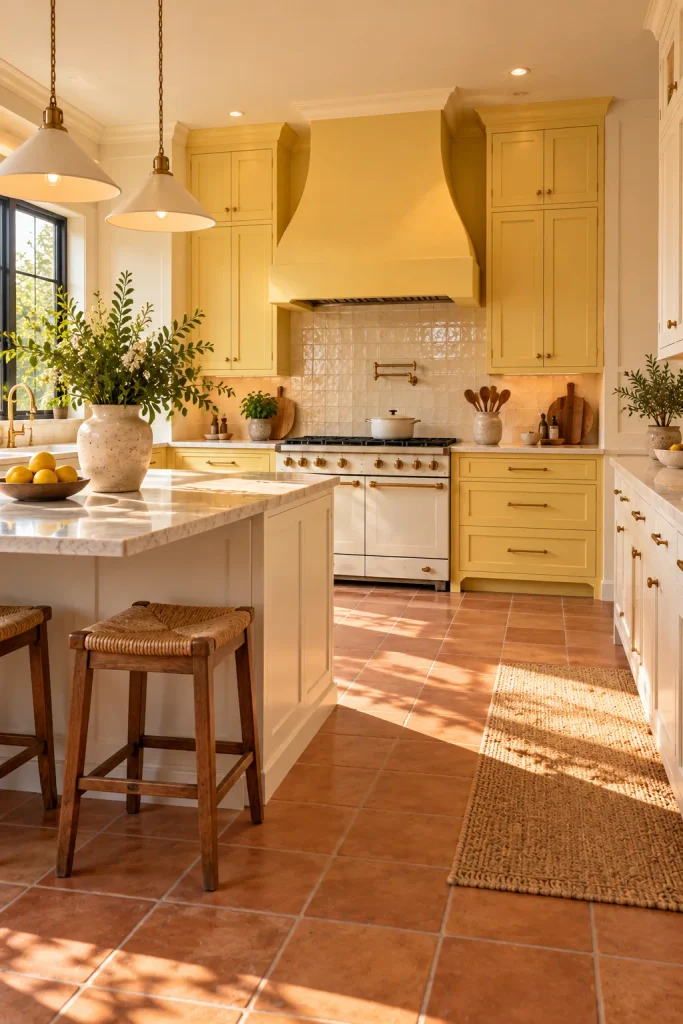
Paint Only the Range Wall Butter Yellow
Instead of splitting by height, put the color where you want eyes to land. Paint the cabinets around the range, plus a plaster hood, in soft butter yellow. Keep the rest of the kitchen linen white. Pick a muted butter with a touch of gray, not bright lemon, so it looks good in every light. A cream range and terracotta floor tiles make the whole wall glow.
Give the Island Two Tones of Its Own
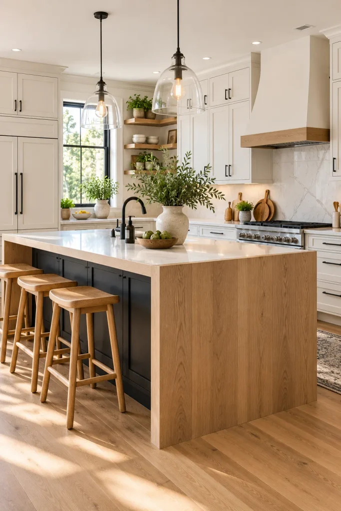
Here the island carries both colors. Paint the island cabinets matte black, then wrap the seating end in a thick white oak waterfall panel. Keep the perimeter cabinets a soft white. The contrast stays in one spot, so the room never feels busy.
The oak panel does a practical job too, since it protects the island end from knees and chair bumps. Choose a white quartz top that runs straight into the oak. Matte black pulls and simple glass pendants finish it off.
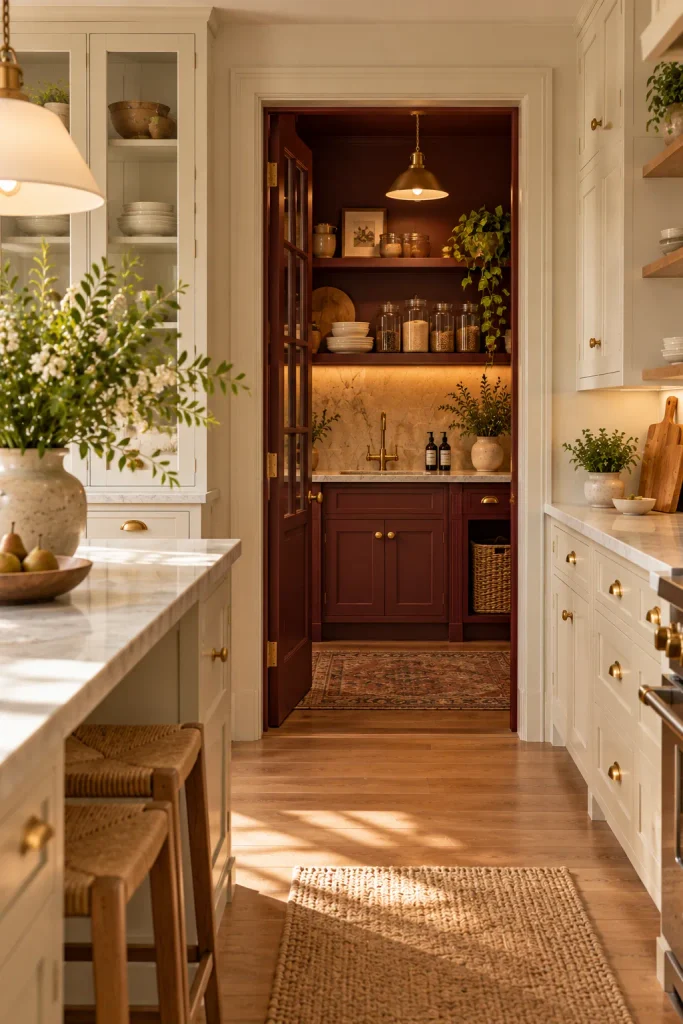
Save the Drama for a Scullery
A scullery, or back kitchen, is a small prep room tucked behind the main kitchen. It’s one of the biggest trends in new homes, and it’s the perfect place for a dramatic color. Keep the main kitchen light and calm. Then paint the scullery cabinets a deep, moody burgundy.
Leave the doorway open or fit a glass door so you catch a glimpse of the color. That glimpse feels exciting without overwhelming the main room. Inside, a small sink and simple shelves keep the space hard-working.
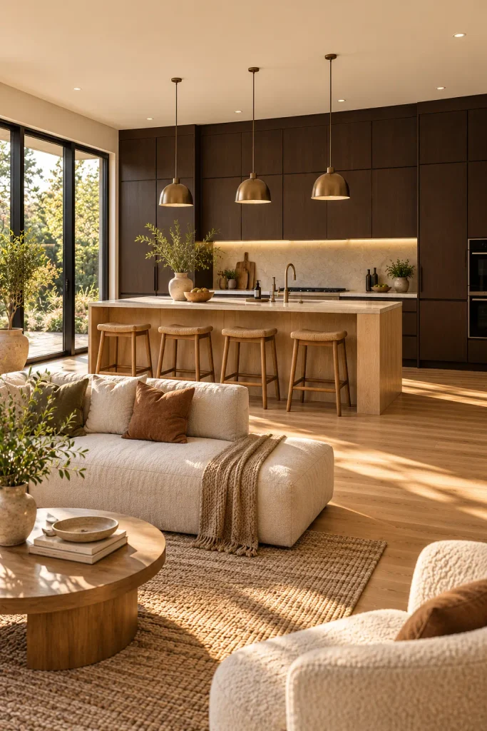
Go Dark at the Back of an Open-Plan Kitchen
In an open-plan home, the kitchen’s back wall is always on show. Paint that whole wall of cabinets, tall units and base units, a deep espresso brown. Dark colors recede, so the kitchen seems to sink back into the room. Then keep the island in pale oak with a light stone top.
The light island becomes the bright center where everyone gathers. Meanwhile, the dark wall quietly hides the mess of everyday cooking. Handleless doors on the back wall make it look like sleek joinery rather than standard cabinets.
Before you commit, paint large sample boards of both colors and prop them side by side where they’ll actually go. Look at them in the morning, then again at night under your own lights. Paint changes more than you’d expect in a kitchen. Two-tone kitchen cabinets look their best when the second color feels like it was always meant to be there, and a few days with samples is the surest way to know.